SRC User Interface Guidelines
You must comply with the Secure Remote Commerce (SRC) User Interface (UI) guidelines and requirements from EMVCo when you present SRC as a checkout option to your payers on your website. This page describes the UI components, corresponding elements, guidelines and requirements within payer interactions for SRC.
Click to Pay UI library
Reference graphics/non-graphics-supported patterns provided on this page describe how to present Click to Pay on your checkout pages.
The are two types of Click to Pay formats:
- Trigger: Any format that initiates and provides the starting point for a Click to Pay experience and is placed on the Digital Payment Application (DPA).
- Non-Trigger: Any format that does not initiate a Click to Pay experience, and can include Click to Pay branding to describe the payment option available to the payer.
For more branding and use case guidelines of the Click to Pay icon with SRC System Operating Images, refer to EMVCo Secure Remote Commerce (SRC): User Interface Guidelines and Requirements on EMVCo’s website.
The Click to Pay UI library includes:
- Click to Pay Asset Terminology
- UI Patterns for Trigger Formats
- UI Patterns for Non-Trigger Formats
- Click to Pay Description Recommendations
Click to Pay Asset Terminology
Assets should be displayed at size and brand parity with other payment logos included in merchant’s checkout UI and follow web color contrast/accessibility standards.
| Asset Name | Asset |
|---|---|
| Button | 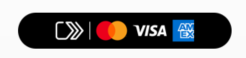 |
| Horizontal Mark |  |
| Vertical Mark (i.e. Click to Pay icon) |  |
| Vertical Mark-fill |  |
UI Patterns for Trigger Formats
UI patterns for trigger formats include:
Graphics-supported in payment method selection
When you use a custom button design and insert the program’s full-color logo on your site, the Horizontal Mark should be used. When a full-button asset is used, it should be in size parity with other payment methods offered.
| Button | Horizontal Mark |
|---|---|
 |
 |
Graphics-not-supported in payment method selection
When your payment method button is not graphics-enabled, the trigger should use a variation of Click to Pay as the Call to Action (CTA) and the graphical Horizontal Mark should be in proximity to the trigger. The placement of the Horizontal Mark in proximity to the trigger is your choice.
DO NOT USE
- Click-to-Pay with hyphens
- Click to Pay™ with trademark
- Click to pay; lowercase "p" not permitted to use as payment label
- click to pay
UI Patterns for Non-Trigger Formats
UI patterns for non-trigger formats include:
- Tab Structure
- Text-only in drop-down format
- Graphics-supported in payment method selection
- Confirmation of payment method used
Tab Structure
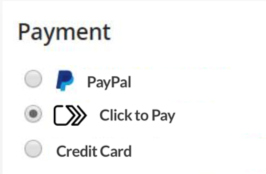
When you use a text-only format to label your payment options in a tab-style interface, the program name should appear on your UI as Click to Pay.
| Scenario | Example |
|---|---|
| Text-label only, graphic button used as Trigger |  |
| Text-label + horizontal mark on page content. Merchant’s button format used as Trigger | 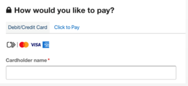 |
| Vertical Mark + text label and descriptive copy. Graphic button used as Trigger | 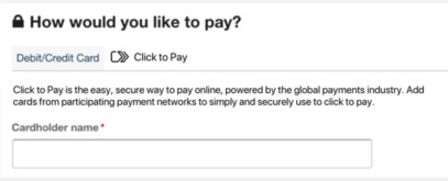 |
Text-only in drop-down format
When you use a native drop-down menu and the selection options support text-only, the label should take the format of the native drop-down text. As a non-trigger format, the button that proceeds to checkout and initiates Click to Pay is a separate interaction that either displays the Horizontal Mark in proximity or uses the Button.
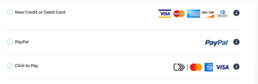
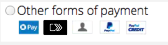
Graphics-supported in payment method selection
When a merchant uses graphics in their payment selection format but the selection does not initiate a Click to Pay experience. There is another Call to Action (CTA) on the page that actually triggers Click to Pay, and therefore, branding can be used in these non-trigger ways.
| Option 1 | Option 2 | Option 3 |
|---|---|---|
 |
 OR 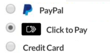
|
 |
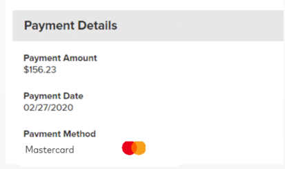
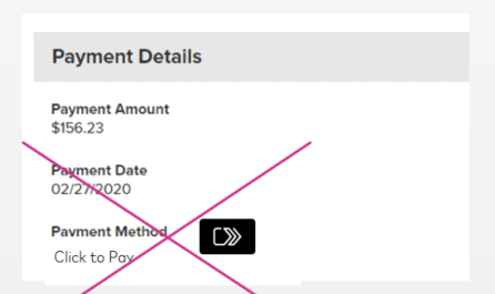
Confirmation of payment method used
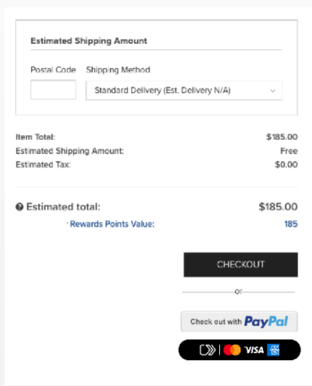
When you display the payment method selected by the payer as a form of confirmation, the payment type could be displayed as text-only or text + graphics on your UI, font style, etc. The network brand card used to checkout via Click to Pay is the brand label/graphic to display in a confirmation use case.
| Use | Do not Use |
|---|---|
 |
 |
Click to Pay Description Recommendations
These are Mastercard Gateway recommendations; however, use your discretion on how content is phrased to describe the Click to Pay experience during checkout.
Gateway-approved content options
- Click to Pay is the easy, secure way to pay online, powered by the global payments industry. Add cards from participating payment networks to simply and securely use to click to pay.
- Click to Pay is the easy, secure way to pay online, powered by the global payments industry. Add cards from participating payment networks to simply and securely use at your favorite online retailers who support Click to Pay.
- Please click the button below to access your Click to Pay profile. Then choose a card and click to pay.
- Scroll down to complete your Click to Pay purchase. This easy and secure way to pay online is powered by global payments industry standards to protect your payment information.
- Mastercard ending in ****1234 was successfully applied from Click to Pay
Gateway-not-permitted content options
- Click-to-Pay with hyphens
- Click to Pay™ with trademark
- Click to pay; lowercase "p" not permitted to use as payment label, but recommended when using "click to pay" as descriptive language or as a verb